The thought occurred to me recently that I have become something of a paper snob. This may or may not be the case, but one thing is for sure: I have high standards. I also have what I would consider a heightened tactile sensitivity and a lower tolerance for discomfort. Basically, I will not hesitate to ditch something that doesn’t give me the experience I seek. Given that roughly 95% time I spend engaging in the physical act of writing is both voluntary and personal, I choose to not settle for anything less than great. So, when I talk about a paper being “fountain pen friendly,” what do I mean?
Vocabulary
First things first, let’s define some terms. As with any field of interest the deeper you get into it, the more specialized lingo you’ll encounter. Stationery is no different, so here are some common descriptors you may have heard around the community.
Feathering is a term commonly used when describing inks on paper. It describes the phenomenon of ink creeping outside the bounds of the intended line mark, creating a crackle or “feather-like” effect on the page. This occurs when a paper cannot contain the ink as it absorbs, allowing the color to seep into the fibers around the application area. This is mostly a visual effect, and not necessarily detrimental to the function of the paper. However, I find it unappealing and distracting while I write.
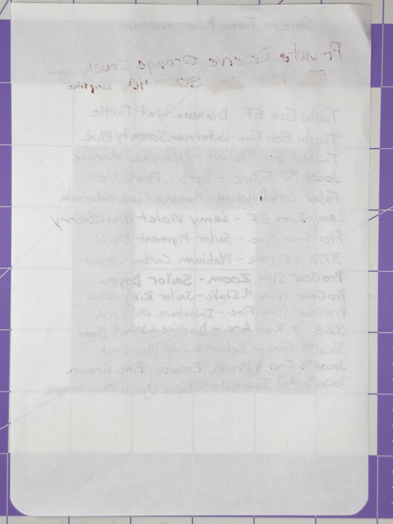
Ghosting is the show-through effect where you can see the writing on the reverse side of a page. Ghosting typically occurs with thinner paper, or more absorbent papers that soak ink deep into the page fibers. Some users elect to write on only one side of the page in their notebook because severe ghosting can cause legibility issues once both sides are full. Personally I don’t mind a bit of ghosting with my notebooks. I like the pages to feel full, but it can look a little messy in some situations.
Bleeding/Bleed through is ghosting taken to the extreme. If an ink bleeds through, the paper has absorbed it so much that it is not only visible on the reverse, it is visible to the extent that it has reached the surface on the other side. In some extreme cases bleed through can even leech onto the next page, leaving ink spots or blotches on an otherwise untouched surface.
Feedback is the general term for the feeling of contact between nib and paper. Generally speaking the finer the nib, the more feedback you’ll experience. An over-polished nib can feel a little glassy with minimal friction or feedback. A rough, unpolished nib can feel like grinding a nail across sand paper, even with the most premium fountain pen paper.
Paper Texture
Smooth paper is generally considered to be the best for most writing situations. Paper stocks that have a smooth, uniform surface may even feel like there is a coating applied, but that is typically more an attribute of the chemical “sizing” applied to the paper in the manufacturing process. Sizing is a whole different area of the paper making process that I am not well-versed in, so I’ll stick to the tactile feel. What I do know is that sizing effects how ink or other mediums interact with and adhere to the surface of the paper, so it is an important consideration for manufacturers when deciding on the intended use of a paper product. Digression aside smooth paper is great for writing with fountain pens because it allows consistent contact with the nib, allowing it to slide easily over the surface of the page.
Textured/Toothy papers can have a rough, almost gritty feeling when writing can be a bit more problematic with fountain pens. These kinds of papers can be very nice from a tactile point of view, but may have issue holding water-based inks as the larger fibers can pick up the ink and feather it in unplanned ways. Another issue with papers such as this is the tendency to pick up loose fibers that get stuck in the tines and interrupt ink flow. On the other hand, toothy papers can be great for gel or ballpoint pens as it gives the ball tip a surface to grip onto and encourage the rolling motion that keeps ink flowing.
Muddy paper doesn’t come up often, but when it does it sticks in my mind. I define a muddy feeling as having more drag than your average paper. The nib doesn’t dig into the surface in a sharp way, it’s more of a sinking feeling. In my experience, Cosmo Air Light is the only mainstream paper to exhibit this characteristic, and I’m really not a fan.
What Qualifies As “Fountain Pen Friendly”
As I mentioned up top my personal standards for fountain pen friendliness might be a little higher than average, but what it comes down to is consistency. To even be considered “friendly” for daily use, a paper must exhibit no feathering, no bleed through, and minimal ghosting with average fountain pens and common inks. There are a number of environmental factors that can alter the effects of ink on paper such as humidity in the air and oils on the page from excessive handling, but paper should perform well within a predictable range. When I pick up a notebook I want to be confident that my writing will look clean and feel comfortable. If a paper cannot perform up to that standard, I don’t consider it for daily fountain pen use.
Beyond basic friendliness, a paper can get extra credit for ink compatibility if it shows off the deeper characteristics of an ink beyond the basic color shade. Brands like Sanzen Tomoe River exemplify this by producing a veritable rainbow of shades from a single-color drop of ink. A paper does not need to reach these heights to be fountain pen friendly, but only a fountain pen friendly paper could..
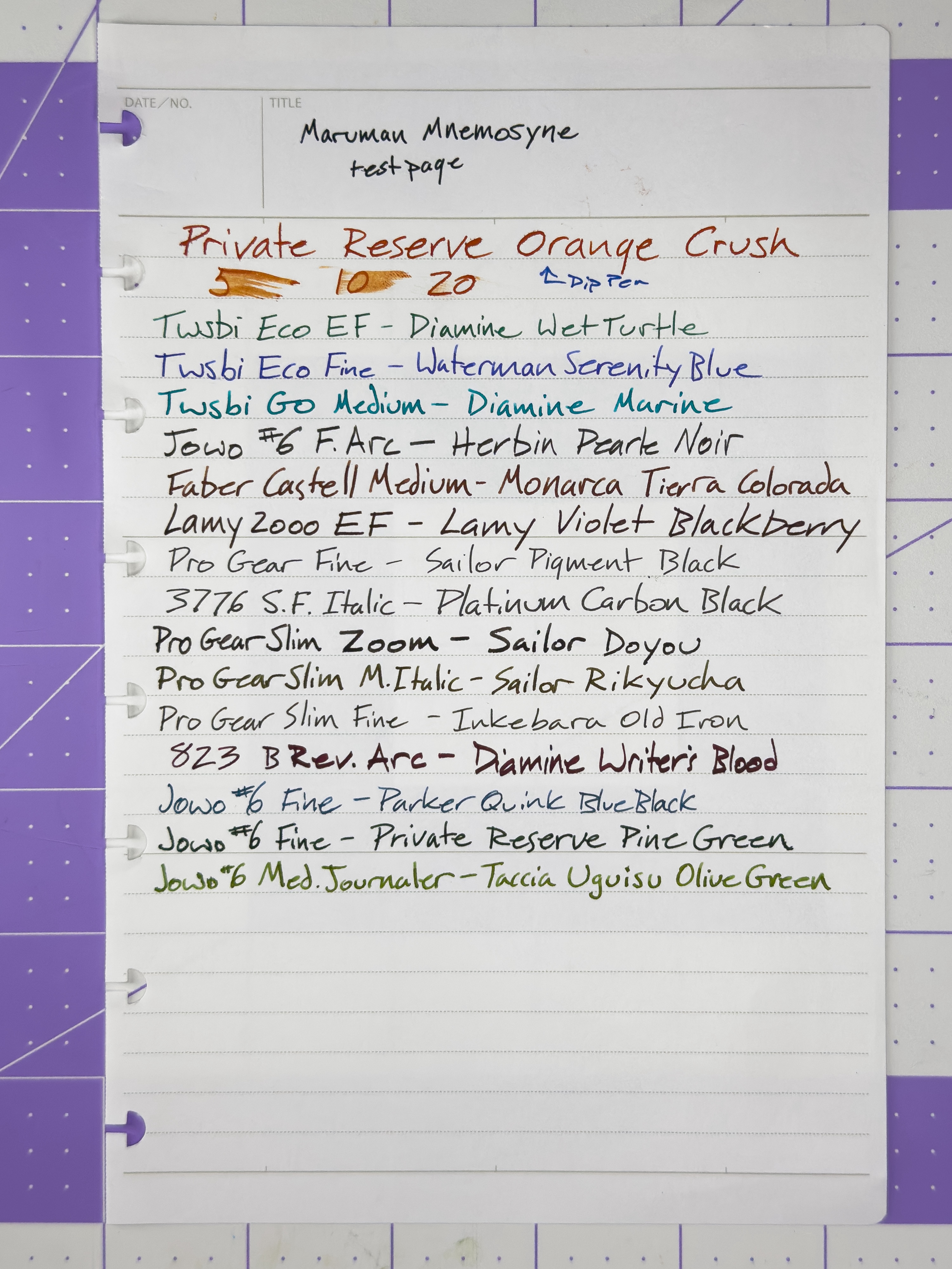
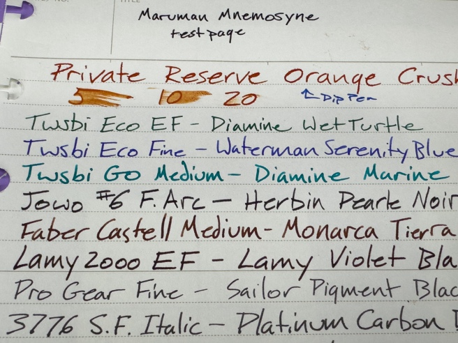
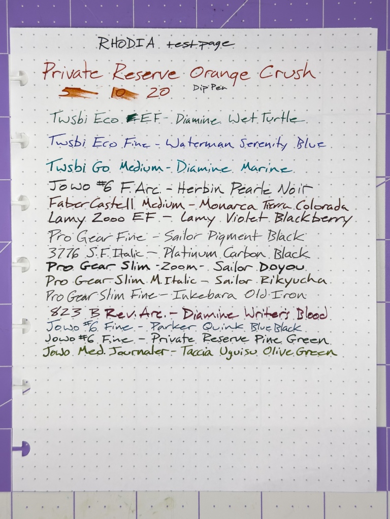
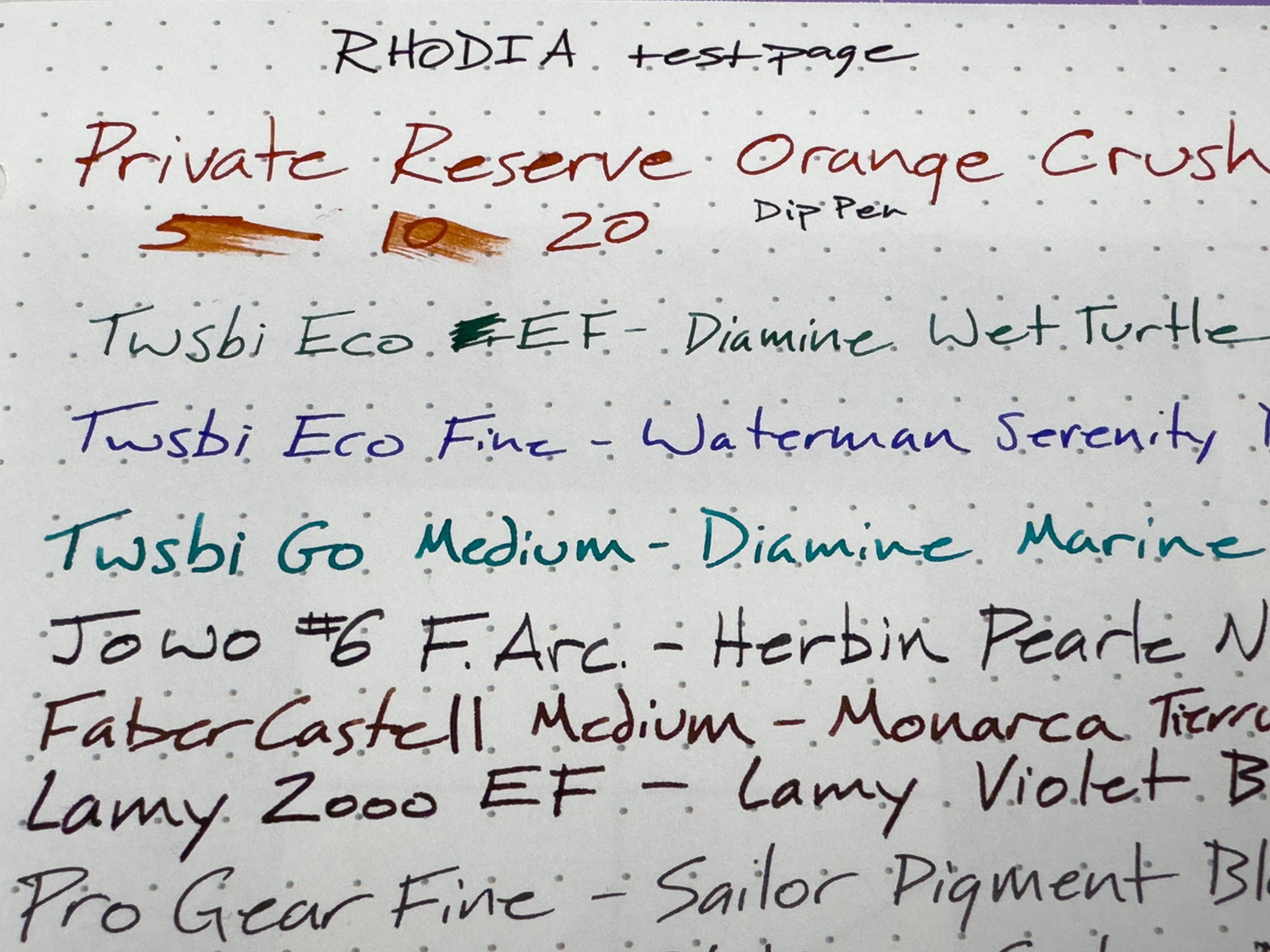
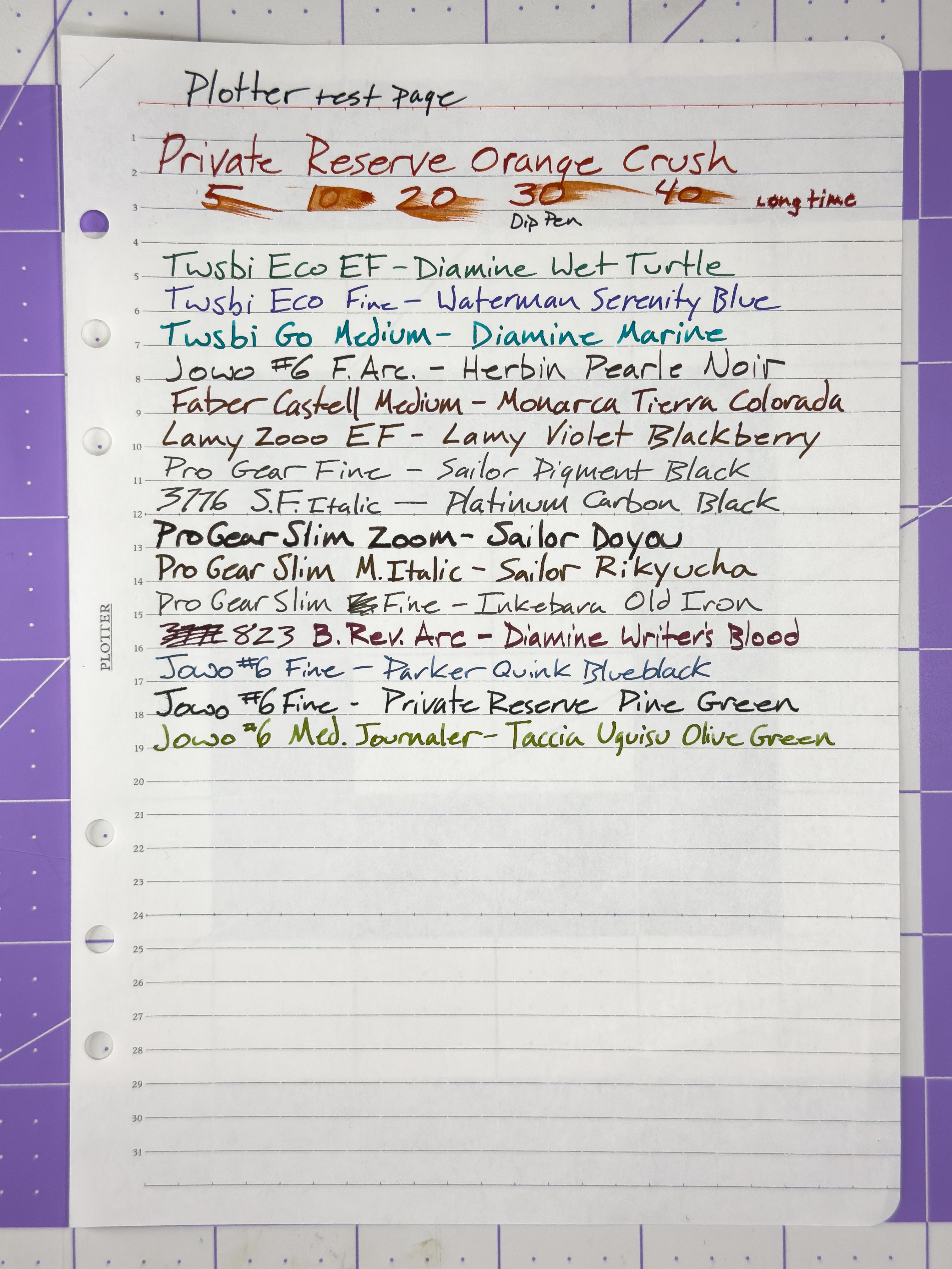
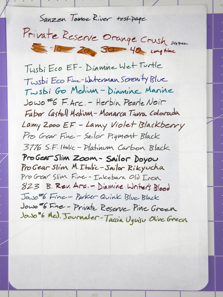
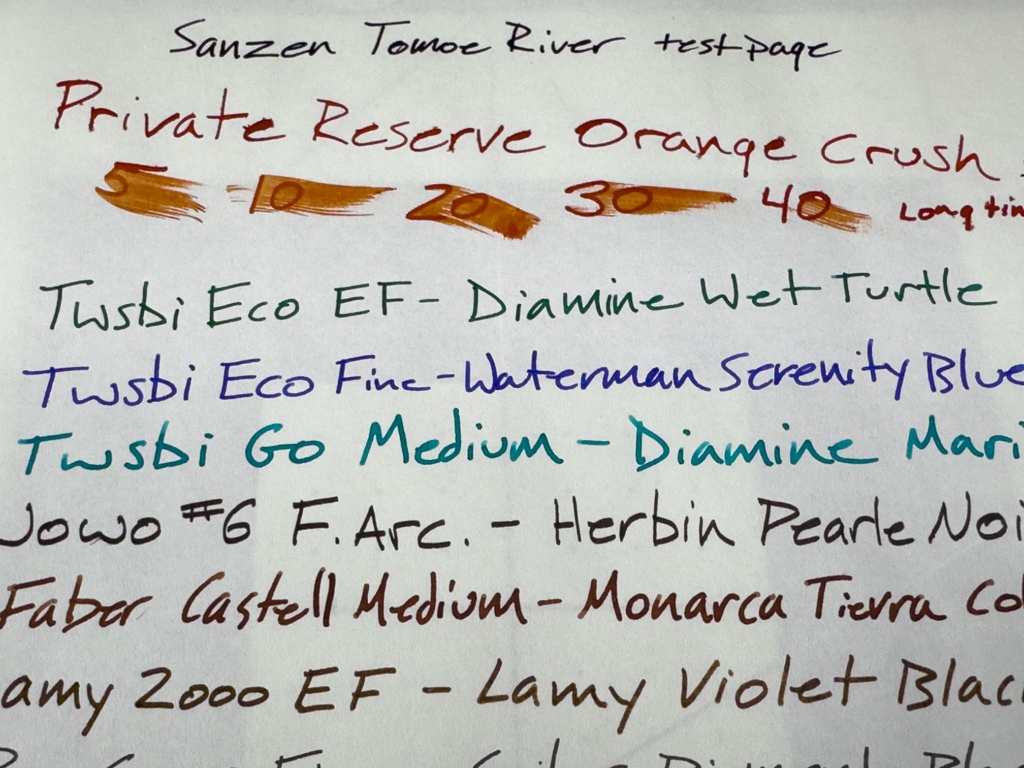
In my several-years journey of stationery exploration, I have encountered and tested dozens of paper brands from all around the world. While not nearly comprehensive, here is a list of paper brands I have found to be both consistently friendly and easily accessible. (Note: Smears represent dry time testing in seconds with a dip pen and Private Reserve ink.)
Maruman Mnemosyne – Definitely an underrated brand. Maruman’s Mnemosyne paper is fun to use as it is hard to spell phonetically.
Rhodia – One of the first fancy paper brands I ever tested. This brand is a heavier stock available in a variety of formats and capable of handling just about any ink you can throw at it.
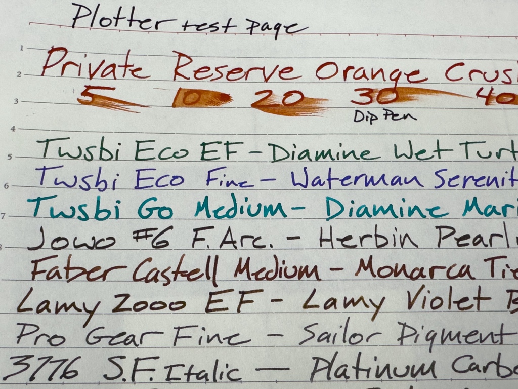
Plotter – Plotter paper is very lightweight, thin, and surprisingly fountain pen friendly. However, the orange 5mm grid paper does seem to show bleed in some situations. This is possibly a result of applying the orange grid finish to the sheet. I have had the best results with the standard blank and lined refills.
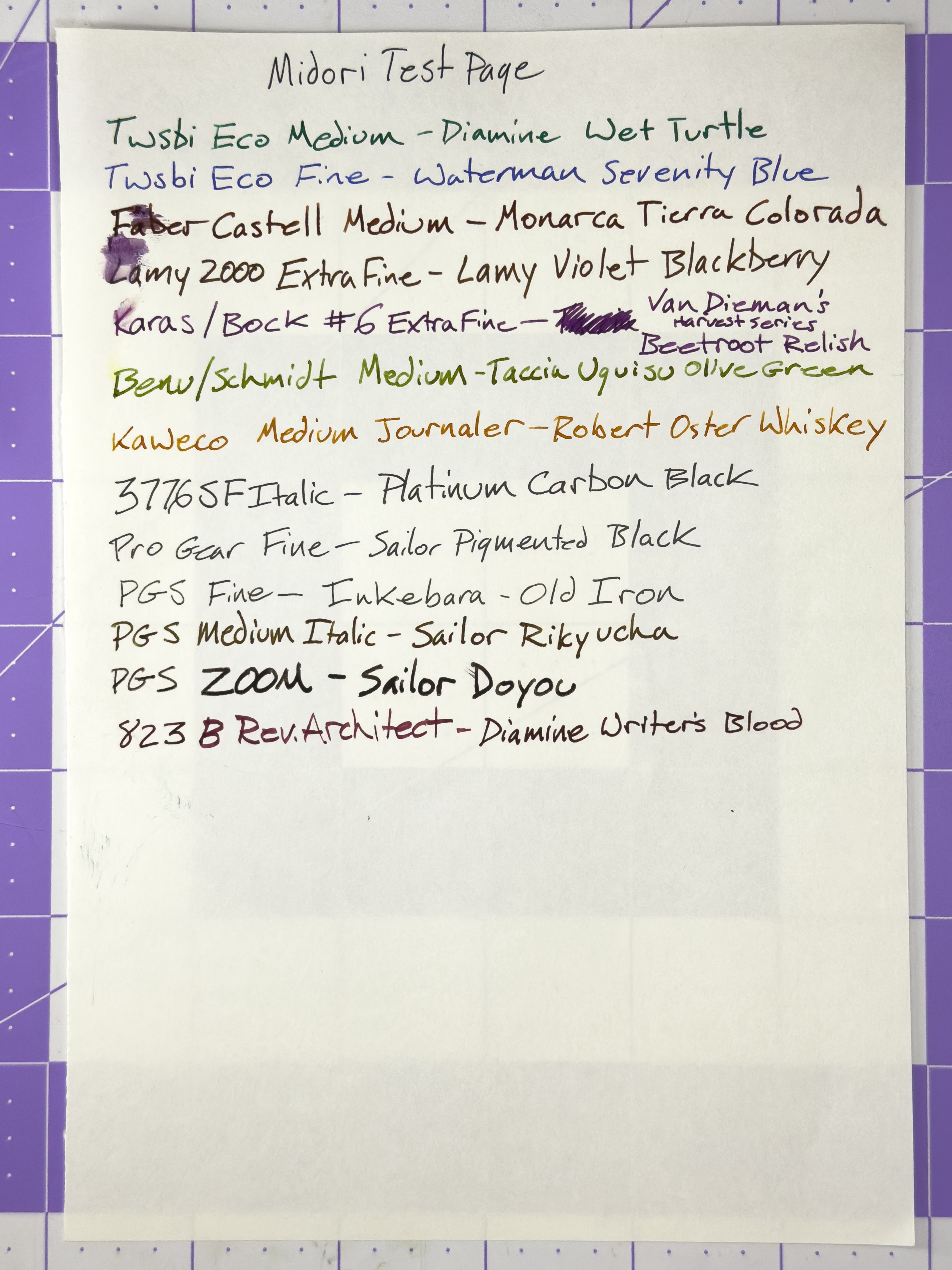
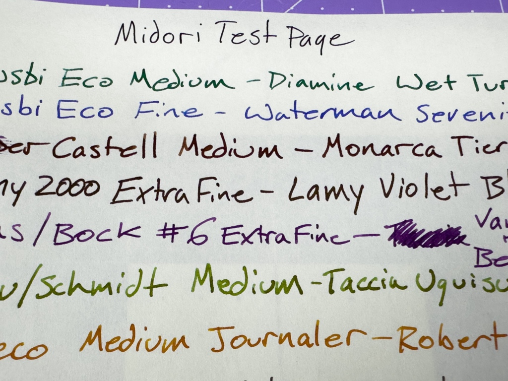
Midori – So technically Midori, Plotter, and Travelers are all under the Designphil Inc. brand umbrella. The papers all come from the same source, but I cannot confirm that they are all made from the same secret sauce. Midori paper feels a bit thicker and heavier than Plotter paper, but it performs incredibly well nonetheless.
Sanzen Tomoe River – Maybe not as good as the original Tomoe River, but that’s gone so I don’t feel right including it in any recommendations. Sanzen Tomoe River is fairly widely available and suitable for 95% of the fountain pen writing situations out there. That said, it does have a little trouble with dip pen writing due to the sheer volume of ink being put on the page. This is on the thin side, so there will be ghosting.
At the end of the day, it comes down to personal preference. How strict do you want to be when it comes to your handwriting? How perfect do the lines you make need to be? How much money do you want to spend on your writing experience? These are questions that each of us must answer during our journey through the stationery world. If I’m doing my job well, hopefully you’re a bit better equipped to find those answers.
Disclaimer: All paper products shown in this article were purchased by me. All opinions stated are my own.

When I started collecting fountain pens a few years ago, my focus was almost exclusively on the fountain pen. By becoming more involved in my hobby, I quickly noticed that ink but also paper are an important factor. The search for the ideal combination is often trial and error. Your post is a useful reference. Thank you.
LikeLike
This was a great read, thanks for posting!
LikeLike