
Well, my pen show season has come and gone, beginning with my local show, the California Pen Show, and ending with “The Fun Pen Show,” the San Francisco International Pen Show. With the show comes new experiences, fun stories, and lots of new purchases. While I do have a few opinions of the show as an attendee with no idea how to organize something like this, I’m more excited to share what I walked away with. It’s a fairly short list, certainly shorter than it could have been. The word of the day is Collaboration.
Vanness Pens x Robert Oster
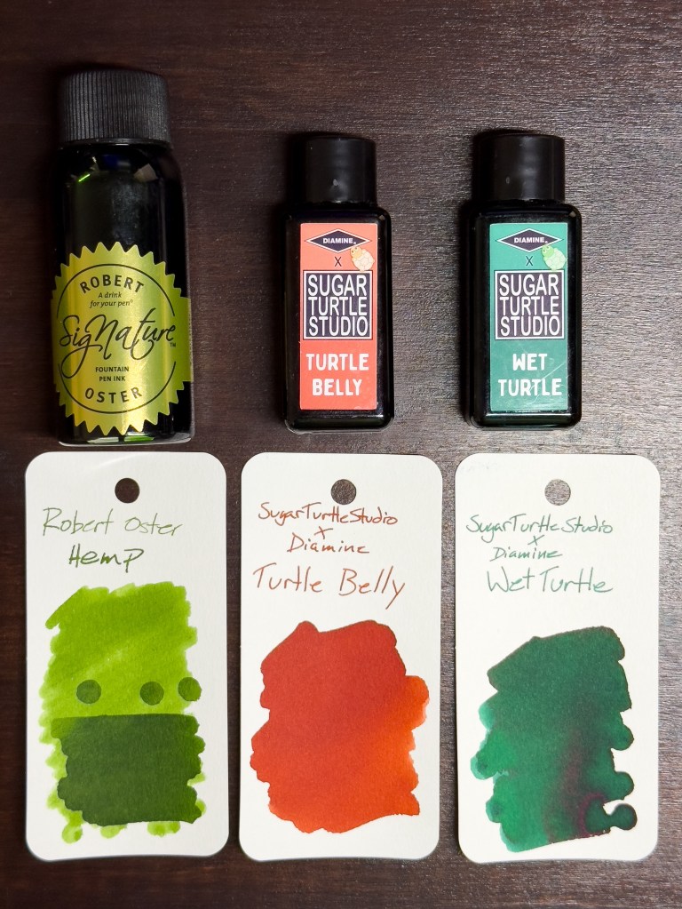
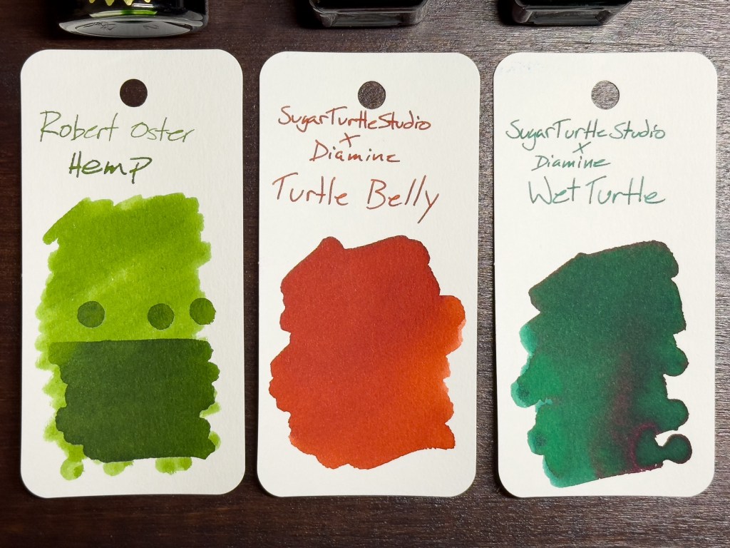
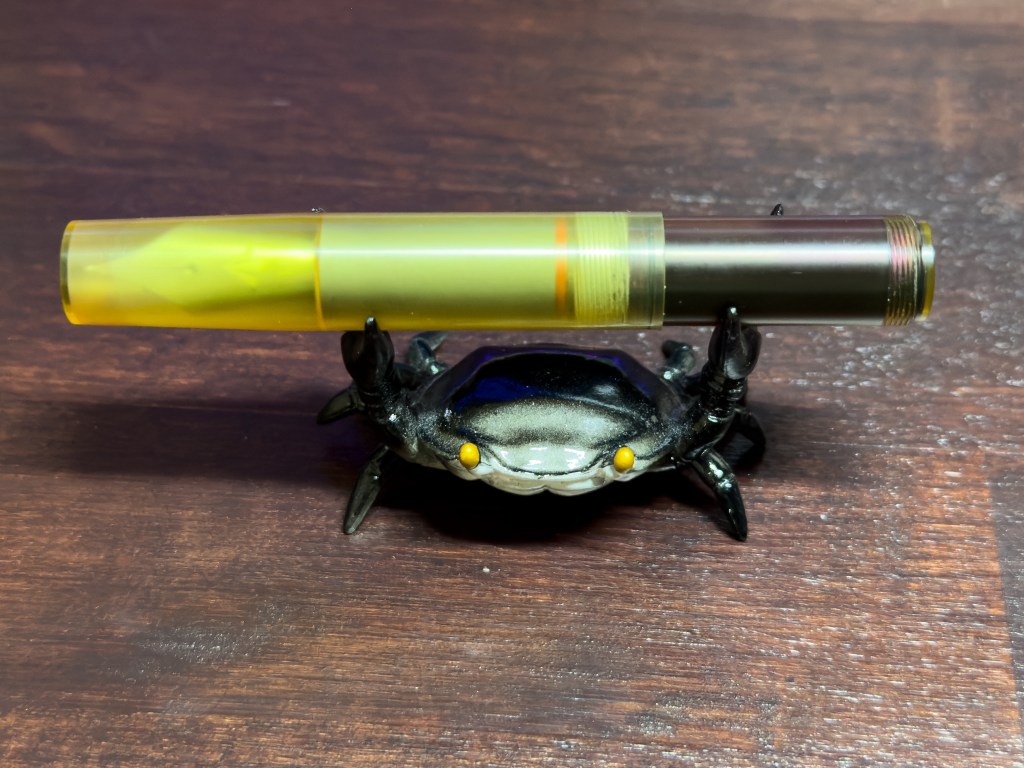
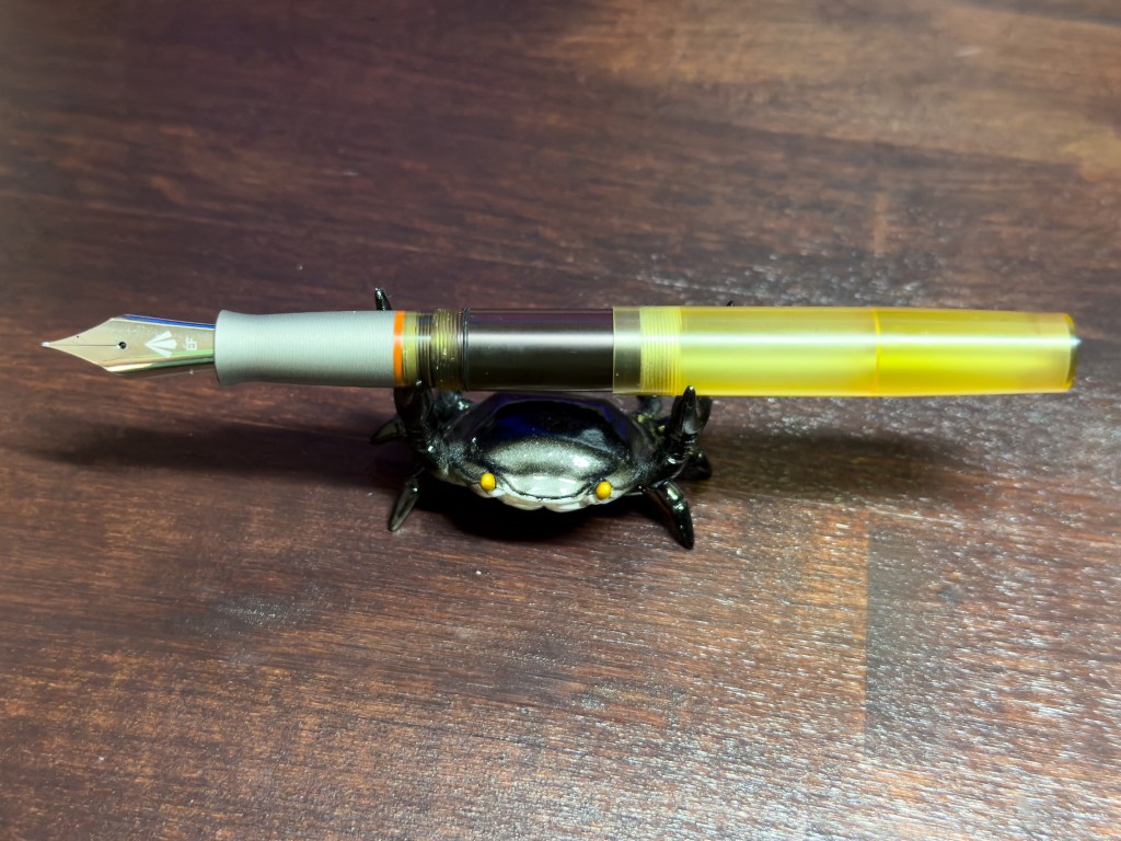
I feel like I’m getting close to finding my ideal green ink. It’s a difficult shade to nail down, and everyone has their own opinions, but after trying a sample vail of this color I knew I wanted to have a full bottle on hand. Robert Oster Hemp is a deep dank green with elements of a hazy shading effect that is common to Oster inks. While this was my only pickup from the vast Vanness table, it’s a worthy purchase. This shade easily makes my shortlist for recommendations of green inks, another example being Diamine Sherwood Green. Coming in at around $18-20 per 50ml bottle, Robert Oster inks are pushing the mid-to-high-range in terms of price point, but their performance and unique visual characteristics make it a must-have brand in any ink snob’s collection.
Sugar Turtle Studio x Diamine Ink
Diamine is one of the all-time greatest fountain pen ink brands. Their core ink catalog covers a huge range of colors with well-performing inks at very reasonable prices (starting around $7). They’re also the brand behind the immensely popular Inkvent calendar and repeat collaborators with the r/fountainpens community resulting in multiple unique, community-designed ink shades.
Sugar Turtle Studio is an artist-run Etsy shop with all sorts of colorful stickers and accessories celebrating pandas, koalas, and the fountain pen enthusiast lifestyle. Their store is now also home to not one but TWO unique shades of ink; Wet Turtle and Turtle Belly.
Wet Turtle is a deep, saturated green and Turtle Belly is an orange so deep and dark, it can look closer to red with wider, more flowy nibs. I’m into it.
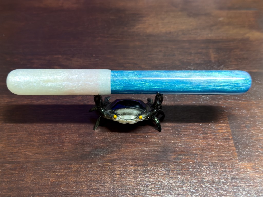
Enigma Stationery x River City Pen Company
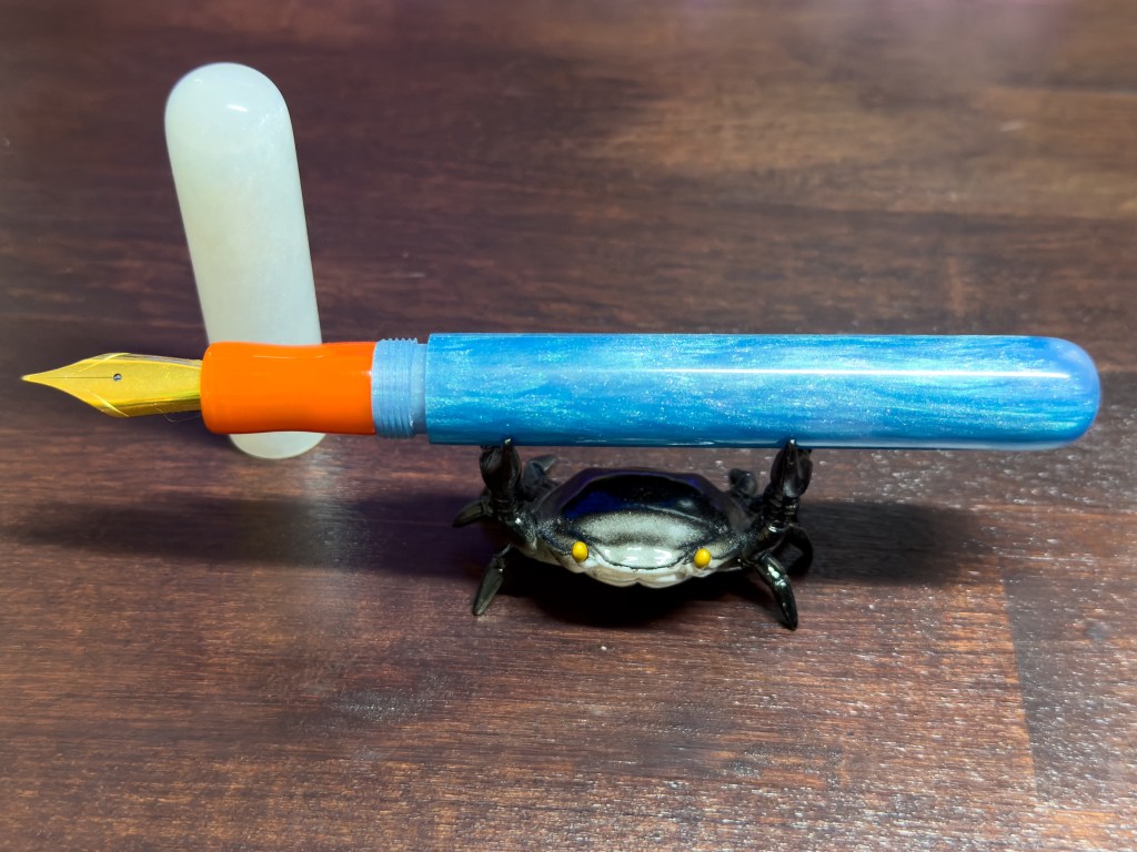
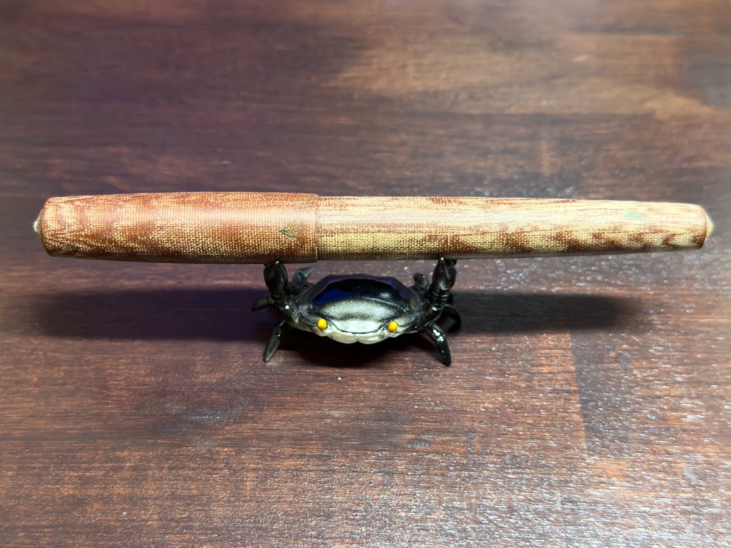
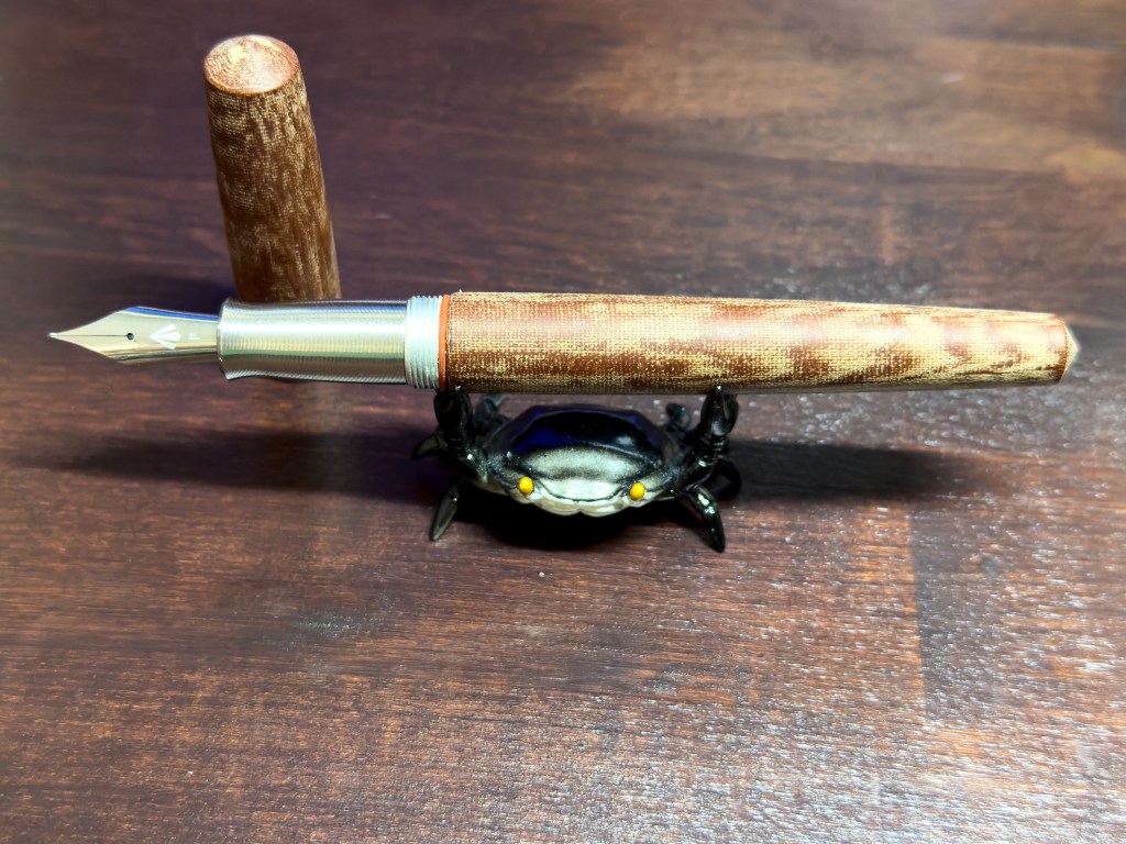
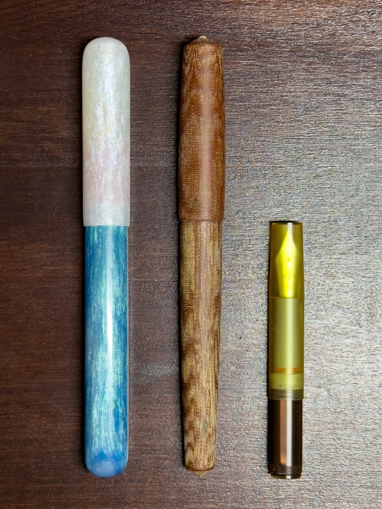
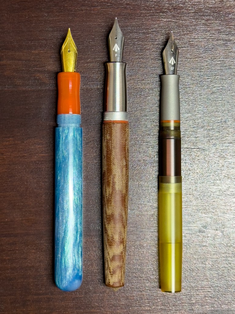
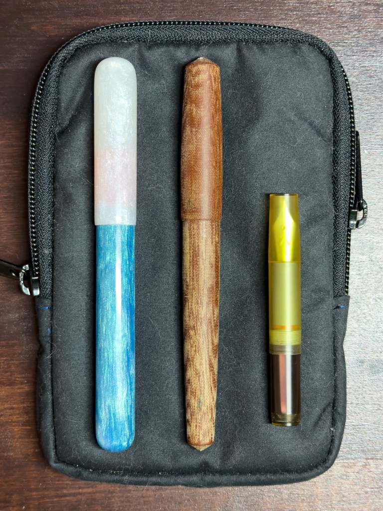
Enigma Stationery’s Special Edition #8 – Fogged In. A fountain pen inspired by the iconic landmark that is the Golden Gate Bridge. Specifically, a photo of the bridge partially obscured by the dense morning fog. The pen features three unique resins representing the colors of water, fog, and bridge in the barrel, cap, and grip respectively. These elements combine to form a unique look that evokes memories of the city of San Francisco and its lovely pen show.
Fogged In is made in the style of River City Pen Company’s model The Elliott. The design features a straight barrel with rounded ends and a smooth, pinched middle grip section. The pen’s Jowo #6 nib writes smoothly as expected, and the balanced light weight makes for a comfortable writing experience. While the grip section might be a little short for some users, the contoured shape provides a nice resting place for your digits. Overall, I love the pen. But it’ll probably exist in my collection as a desk piece sitting on display and ready to use. Maybe it’s just too pretty, too unique to be taken out into the world where any harm could come to it.
Gravitas Pens(x2)
Alright so the Kyuseido Kakari FS (a Gravitas & CY collab) was a little out of my range, but I did have the privilege of trying out the pen while chatting with someone who took the plunge. It’s a great pen, beautifully engineered, unique, and the first of its kind. What I did bring home was two other independently interesting, if not quite as innovative, pens that are a bit more my speed; the Micarta, and the Quark.
The Quark is a fountain pen for ants. It is an ultem pen with a titanium grip that fits just as well in the palm of your hand as it does in the crevice between couch cushions. This pen has a capped length of only 84mm (3.3in.) and a posted length of 132mm (5.19in.), making it one of the smallest pocket pens on the market. Equipping the Quark with a Jowo #6 nib narrows that list of peers down even further.
Writing with the Quark is very comfortable. The titanium grip places most of the weight towards the front of the pen, making it easy to hold and write with. Some lighter-weight pens with more even distribution can feel almost weightless when writing around, so having that center of gravity close to the business end tends to be more comfortable.
The Micarta is, well, micarta. More specifically it is an aluminum core inside a red linin micarta shell. This pen has a tapered shape, with its widest point around the center of the cap, tapering down steadily to the end of the barrel. There is a slight step down from cap to barrel, with a subtle Gravitas logo etched into the side. The stainless steel grip section curves inward, coming to a soft finger-stop up front. The surface features “micromachined grooves” which provide a good grip and a nice tactile feel to the pen. The Micarta feels hefty, weighing in at 40.7 grams capped. Somewhat above average, but not so heavy that it causes strain or discomfort while writing. A TWSBI Eco, for comparison, weighs only 21 grams.
Overall, I’m enjoying these pens. They are well-tuned and write comfortably with no post-purchase nib-fiddling required. The Micarta material has inspired a curiosity for other ways of utilizing the material in stationery device designs. One issue I did run into was a separation of the micarta sleeve from the aluminum core inside. Nothing was broken or cracked, it was likely just a failure of whatever glue or epoxy that was meant to be holding it together. What I should have done at that point was put everything down, take some pictures, and send an email or DM to Ben. What I did do was slap some superglue in there and press the parts back into place. While I wouldn’t call this an ideal use-case scenario, it isn’t an experience-breaking event. I still like the pen and will continue using it, but this might be something to address in future iterations of the design and manufacturing process.
All That Remains
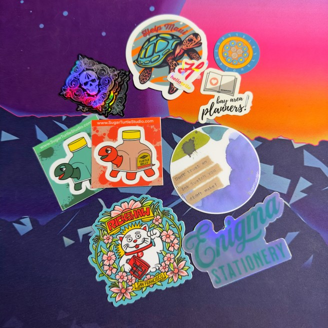
Rounding out my purchase list are a few smaller items; a delightful little Traveler’s Factory YOSEGI Charm, a surprisingly turtle-heavy-handful of stickers, and a nice Parker Jotter from Geoffrey Parker, who was there handing out pens with his (great-great-grandfather’s) name on them.
Adjacent to the show, we attended an open-table hang-out organized by The Stationery Cafe. There gathered the friendly faces of show-goers eager to share the pens they’d purchased mere hours prior. It was during that time that I had the opportunity to test out some truly interesting and uncommon pens, like the previously-mentioned (and at-the-time unnamed) Kakari FS, a SCHON Pocket Six as well as the Monoc nib, and something that I truly never thought I’d get to try: a Dorsal Fin Nakaya. Even if I had taken any photos of those pens I tried, they would not have captured the full artistry on display with some of these pens. The longer I am in this pen hobby, the more pen shows I attend, the more I appreciate the pieces that go so far beyond simple function. My purchase ceiling is still around one-third the price of an entry-level Nakaya, but my admiration for the processes through which they, and other premium fountain pens, are created has only grown over the past several years.
The San Francisco Pen Show has earned its reputation as The Fun Pen Show for another year. Although I have only attended three different pen shows (and all of them here in California), SF is easily my favorite. While I do have some opinions about the choice of venue and spacing of the show this year, this write-up has waited long enough.
This post features products purchased by the author for review and consumption. All opinions are my own.

One thought on “Pen Show Pick-Ups: An Over-Due Overview”